26 October 2026
What Is a CTA, and Why Are They Important?
A CTA is the part of a page that asks the visitor to do something. Here is why they decide what a website earns, and how to write ones that work.
A CTA, short for call to action, is the part of a page that asks the visitor to do the next thing. It is the button that says Get a quote, the phone number in the header, the Book a consultation link at the end of a service page. Anything that invites somebody to act, rather than just telling them something, is a call to action.
They matter because a website that explains everything and asks for nothing produces nothing. You have already paid for the visitor, in search work, in advertising or in the time it took to build the page they are reading. The call to action is the only part of the page that converts that attention into an enquiry, so a weak one quietly wastes everything spent upstream of it. We are Seonat, a UK agency, and on our own site a test fails the build if the main call to action is missing from the header, the hero or the footer, which tells you how seriously we take the point.
You pay for the visit whatever happens. The call to action is the only part of the page that turns it into an enquiry.
What counts as a call to action
More than the obvious button. On a typical service page the real list includes the filled button at the top of the page, the phone number in the header, the enquiry form, the email address in the footer, a Request a callback link beside a price, and the closing line that tells somebody what to do next.
Some of those are stronger than others, and which one does the work depends entirely on the business. A roofer dealing with an emergency needs the phone number in front of somebody within a second. A mortgage adviser gets more from a form that gathers a little detail first, because the first conversation is easier when the basics are already known. The right primary action is the one the business actually wants, not the one that looks best in a design.
Why one main action beats three
The common mistake is offering everything at once. Call us, email us, book a call, download the guide, follow us, join the mailing list. Each one competes with the others and the page ends up asking for nothing in particular.
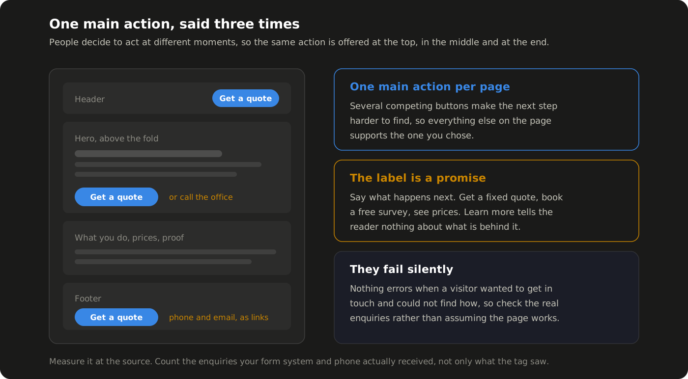
The GOV.UK Design System, which is about as battle tested as design guidance gets in this country, puts it plainly. Use a default button for the main call to action on a page, and avoid using multiple default buttons on a single page, because several competing main actions make the next step harder to find. That is the rule we follow on every site we build. One primary action per page, decided before the first line of code, then repeated rather than multiplied.
Repeated matters. The same action belongs in the header, near the top of the page and again at the end, because people decide to act at different moments. On our own build the main action is a filled button in all three of those places, and that is the thing the test above protects, after the footer spent a while carrying a plain text link instead.
Write the button like a promise
Label wording does more work than most people expect. Nielsen Norman Group's research on link and button labels found that good ones are specific, sincere, substantial and succinct, and that people scan pages rather than read them, so a label has to make sense on its own. Their blunt verdict on the most common button text in the world is that "Learn more" has become the new Click here, because it tells the reader nothing about what is on the other side.
Sincere is the one that gets broken most often in our trade. A link is a promise, so a button that says More info and opens a contact form has lied to somebody, and that is a poor way to begin. Say what happens next. Get a fixed quote. See prices. Book a free survey. Call the office. Each of those tells a visitor what they are agreeing to, which is also what makes them comfortable enough to click.
Keep the commitment small where you can. Ask for a survey, not a signature. The point of a call to action is to start a conversation, and a smaller first step starts more of them.
A link is a promise. If the button says More info and the click opens a form, the promise is broken before the conversation starts.
Make the action easy to complete
A good button pointed at a bad next step still loses the enquiry. Forms are where this usually goes wrong, so keep them short, ask only for what you genuinely need, and make it obvious which fields matter. Then check the form on a phone, because that is where most people will meet it.
The most expensive version of this is the call to action that quietly disappears. On one client's site, a windows and doors company, a rebuild left the email address out of the header and the footer, where the old site had carried it as a link. Email clicks went from 14 in August to 1 in September, which accounted for 13 of the 17 fewer enquiry actions that month. Nothing on the site looked broken, nothing errored, and the drop showed up only because the figures are checked by hand every month. Putting the link back is in the work for October, and it is ours to fix rather than anything the client did.
That is the honest shape of this problem. Calls to action fail silently. There is no error message when somebody wanted to get in touch and could not find how.
How to tell whether yours are working
Measure them, and measure them at the source. Conversion tracking is what turns a guess into a number, and it is the first thing we fix on any account we take over, for the reasons we set out in why conversion tracking matters.
Be careful about which number you trust. On that same client's September figures, Google Analytics recorded 9 form submissions while the form system itself had received 17. Analytics only records a submission when the visitor accepted cookies and the tag fired, so on any site with a consent banner it reads low. We count the real submissions by hand for every client report rather than taking the tracked figure, because the difference between 9 and 17 is the difference between telling a business its website is struggling and telling it the website is working.
The numbers worth watching are simple enough. How many people reached the page, how many started the form, how many finished it, and how many phone calls and emails arrived. If a page gets traffic and produces nothing, the call to action is the first place to look, not the last.
Where to start
Open your most important page and ask three questions about it. What is the one thing I want somebody to do here, can they do it from the top of the page without scrolling, and does the button tell them what will happen when they press it. Most sites fail at least one of those on the page that matters most to them.
If you would rather have somebody go through it with you, that is part of every website design project we take on, and it is usually the cheapest improvement available to a site that already gets visitors. The results we report back to clients, set out in what we actually deliver, are measured in enquiries for exactly this reason. Get in touch with the team at Seonat and we will tell you what your pages are asking for, and what they are not.
Want this working for your business?
Tell us where you are now. We will come back with a clear picture of where you are losing ground online, and exactly how we would fix it.